Syktyvkarskiy LPK updates design of Snegurochka brand
SLPK informs that the design of its most recognizable brand Snegurochka changes starting from the middle of October. It will be a step-by-step transfer to a new packaging, and there will be a certain period of time when both old and new packaging could be found on the market.
«Snegurochka is a brand trusted by millions of buyers. The brand has acquired reputation of a reliable and high quality product since its launch on the market. High quality raw materials and state-of-the-art technologies allow us to guarantee excellent paper quality complying with high global standards. We made a decision to give Snegurochka a more functional and modern design, also taking into account the opinion of our customers from the latest poll», said Klaus Peller, Managing Director of SLPK.
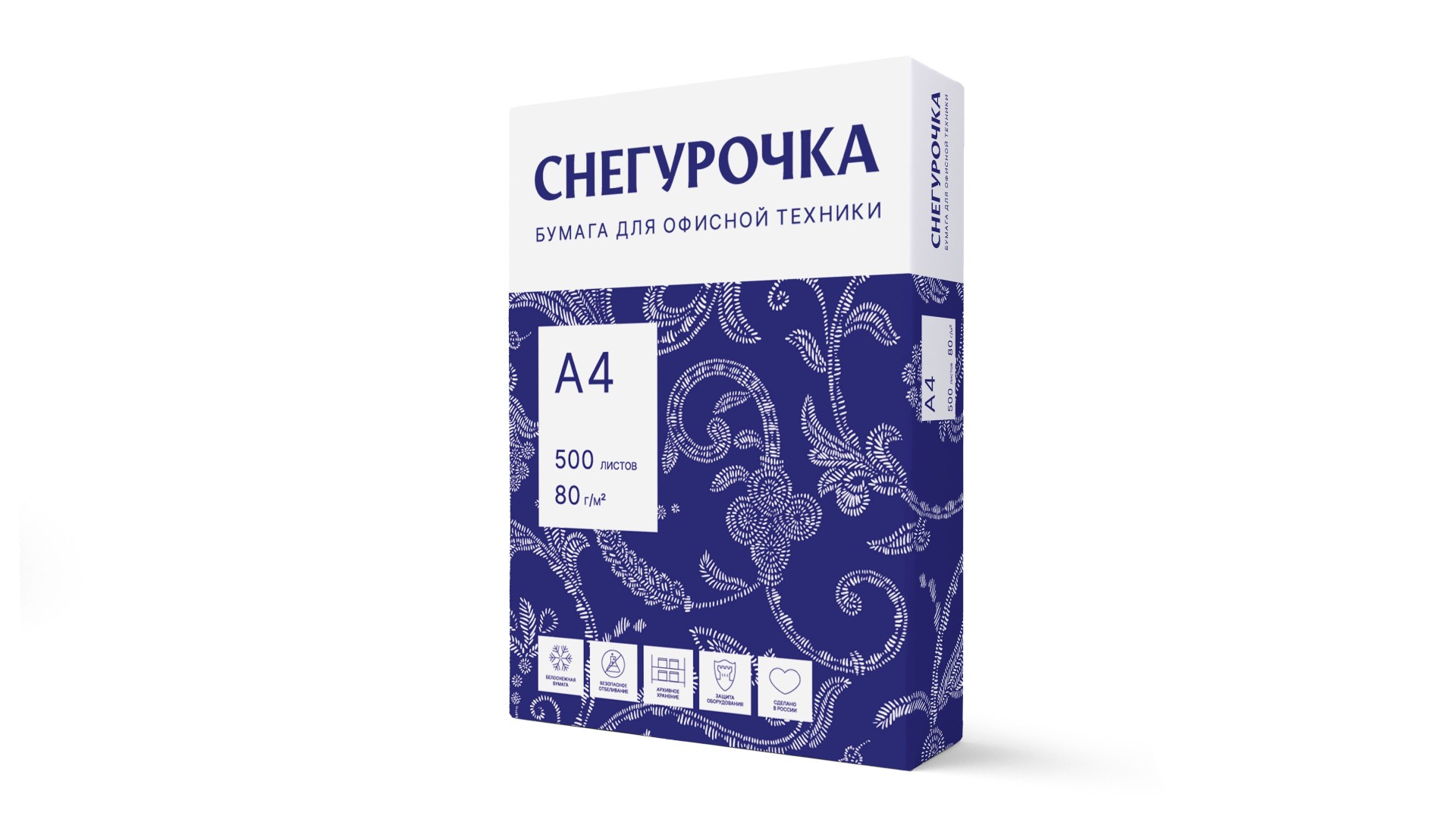
Elena Berezina, Head of Marketing of SLPK shares the details about changes in the Snegurochka ream design: «The recognizable ornament and the blue color, which are the main elements of the design, remain the same. But the share of the blue on the ream is now even bigger, which makes the Snegurochka more noticeable on the shelf. The logo size increased, the familiar wave was replaced by a straight line, giving the packaging a more business-like, distinct and modern look. Paper parameters, which are located in the white area on the front of the ream, have bigger font now, specifically giving more emphasis to the whiteness, archival storage and other advantages. We also updated the texts on the back of the ream, placing the information about compliance with the National System for Forest Certification. Moreover, we reinforced flaps, making the ream even more reliable».
SLPK will hold an advertising campaign to support the changes of the Snegurochka ream design.